





Sooner
Brand Guidelines
v2.2 - July 2026
Website
joinsooner.com
Mission
Making homeownership accessible in Dubai
Tagline
Mortgages with the lowest upfront cost in the UAE.
For Agents (Markdown)
Your down payment
is all you'll need.
Sooner offers mortgages with the lowest upfront cost in the UAE: we win the lowest rate from the UAE's top banks, then finance the closing-cost stack - up to AED 500,000, repaid monthly - so people can own their home - sooner.

What we do

We cover the upfront costs that stop people from buying. DLD fees, agency commission, mortgage processing - we pay them so you don't have to. You pay us back over time, after you've moved in.

Brand personality

Confident. Direct. Minimal. We don't explain - we show. We lead with numbers, not promises. Every word earns its place. Every pixel breathes.

Palette
Yellow is an accent, never a flood. Cream breathes. Dark anchors. White cleans. Restraint is the point.

Primary

Sooner Yellow
#E9FE0F
Soft Yellow
#E2F55C
Dark
#1C1B17
Cream
#F5F4F0
White
#FFFFFF

Secondary / UI

Grey Text
#6B6B6B
Subtle Border
#E5E4E0
Muted
#A5A4A0
Placeholder
#9B9B9B

Special tints

Yellow Tint 12%
rgba(233,254,15,0.12)
Yellow Tint 30%
rgba(233,254,15,0.3)
Yellow Highlight
rgba(233,254,15,0.55)
Manrope
Our typeface is Manrope - a modern geometric sans-serif from Google Fonts. Clean, highly legible, and works across every context.
Hero / Display
59px - Weight 500 - Line 1.2
Own your home
Heading 2
47px - Weight 500 - Line 1.15
Your down payment is all you'll need
Heading 3
24px - Weight 700 - Line 1.25
What's your property budget?
Body
16px - Weight 400 - Line 1.5
Sooner covers your upfront costs - DLD fees, agency commission, mortgage processing - so you can move in now and pay us back over time.
Section Label
11px - Weight 600 - Uppercase - Letter-spacing 0.1em
MORTGAGE PRE-APPROVAL
Small / Disclaimer
13px - Weight 400
Subject to eligibility. Terms apply. Sooner is not a bank or mortgage provider.
The yellow highlighter
Our signature. A yellow marker drawn through words - not under them. Two variants: static and animated sweep.
Your down payment is all you'll need.
You're eligible for AED 165,720 in support
Highlight sweep animation
An animated variant where the highlight sweeps in from left to right. Used on the initial question heading in forms. Click to replay.
What's your property budget?
/* Highlight sweep */
.highlight-sweep {
  background-image: linear-gradient(transparent 15%, #E9FE0F 15%, #E9FE0F 82%, transparent 82%);
  background-size: 0% 100%; background-repeat: no-repeat;
}
.highlight-sweep.animate { animation: highlightSweep 0.8s 0.2s ease forwards; }
@keyframes highlightSweep { to { background-size: 100% 100%; } }
Buttons & Inputs
Two button systems: rectangular (marketing) and pill (app). Yellow for primary actions. Arrow signals forward momentum.
Marketing buttons (rectangular)
App buttons (pill)
Used in the underwriting funnel and dashboard. Full-width, rounded, 700 weight.
Shimmer button
A subtle gradient sweep on the primary CTA to draw attention. Used sparingly - only on the single most important action on a screen. 3s loop.

/* Shimmer */
.btn-shimmer::after {
  content: ''; position: absolute; top: 0; left: -100%;
  width: 50%; height: 100%;
  background: linear-gradient(90deg, transparent, rgba(255,255,255,0.25), transparent);
  animation: shimmer 3s ease-in-out infinite;
}
Bordered input (marketing)
Bottom-border input (app)
Ghost placeholder, animated yellow focus line that expands from center. Used in all form steps and overlays.
AED
+971
.input-wrap { border-bottom: 2px solid #E5E4E0; }
.input-wrap::after {
  content: ''; position: absolute; bottom: -2px; left: 50%;
  width: 0; height: 2px; background: #1C1B17;
  transition: width 0.3s ease, left 0.3s ease;
}
.input-wrap:focus-within::after { width: 100%; left: 0; }
OTP input
4 digit boxes with auto-advance. Border turns yellow + subtle tint on fill.
.otp-box { width: 56px; height: 56px; border-radius: 12px; border: 2px solid #E5E4E0; }
.otp-box:focus { border-color: #1C1B17; }
.otp-box.filled { border-color: #E9FE0F; background: rgba(233,254,15,0.08); }
Underwriting funnel
The form patterns that power the Sooner application flow. Every interaction is designed to feel immediate, confident, and frictionless.
Choice cards
Single-select options with keyboard hint badges. Yellow fill on select with snap animation. Click to toggle.
1Yes, I have one in mind
2Not yet, still exploring
Area chips / multi-select
Pill-shaped multi-select with max selection (3). Yellow fill on select. Unselected chips fade when max reached. Click to toggle.
Dubai Marina
Downtown Dubai
Business Bay
Palm Jumeirah
JLT
Dubai Hills
JVC
Meydan
Section labels
Small caps labels used to group form sections. 11px, uppercase, letter-spacing 0.1em, muted color.
Live calculator card
Appears below the property value input. Rows animate in with staggered delays. Total uses 800-weight with large font size.
Down payment (20%) AED 400,000
DLD fee (4%) AED 80,000
Agency commission (2%) AED 40,000
Mortgage processing AED 26,250

Total upfront AED 553,600
Progress bar (weighted)
Dark track with yellow fill and glowing dot at the leading edge. Fixed to top of form. Fill has pulse glow animation.
.progress-bar { height: 3px; background: #1C1B17; }
.progress-fill { background: #E9FE0F; transition: width 0.5s cubic-bezier(0.4,0,0.2,1); }
.progress-fill::after { /* glowing dot */
  box-shadow: 0 0 8px #E9FE0F, 0 0 16px rgba(233,254,15,0.4);
}
Progressive disclosure (auto-advancing)
Fields reveal one at a time as the user completes each. Uses max-height transitions for smooth expansion. Keeps focus flowing naturally.
Type 3+ characters to reveal the next field
.progressive-section { max-height: 0; overflow: hidden; opacity: 0;
  transition: max-height 0.45s cubic-bezier(0.4,0,0.2,1), opacity 0.35s ease; }
.progressive-section.open { max-height: 800px; opacity: 1; }
Dashboard & screens
The component library that powers the Sooner dashboard, payments, and account screens. Light theme only - cream background, white cards.
Balance card
Primary dashboard card showing the user's Sooner support amount. Badge indicates status (Pending/Verified/Activated). Includes progress bar and link.
Your Sooner support Pending activation
AED 165,720
towards your upfront costs
3 steps to activation 1/3 complete
Progress timeline (phase strip)
Horizontal 3-phase timeline. Done = yellow circle, Active = dark fill white text, Upcoming = grey. Connectors turn yellow when previous phase is done.
1
Apply
2
Verify
3
Activate
Steps-to-activation bar
Card showing completion progress with step count and optional time estimate. Yellow fill with smooth transition.
3 steps to activation ~5 min
Trust / commitment banners
Soft yellow tint background cards with checkmark icon. Used for zero-commitment messaging and reassurance. Place between key action areas.
Zero commitment to apply
Check your eligibility with no obligation
Repayments only start once you use your funds
No upfront fees, no hidden charges
Document upload cards
Text-only (no emojis). Yellow left border when uploaded. Locked state at 50% opacity. Upload button inverts on hover.
Emirates ID Front and back
Salary certificate From your employer
Bank statements Last 3 months
Floating CTA
Sticky bottom button with optional step count subtitle. Shadow for elevation. Used on dashboard when user has pending actions.
Toast notification
Light theme, slides down from top. White background, subtle border + shadow. Auto-dismisses after 3s. Click to demo.
Document uploaded successfully
Payment breakdown cards
Used in the payments overlay. Yellow left border when unlocked/ready. Pay button is yellow when active, grey when locked.
DLD fee (4%) Dubai Land Department registration
AED 80,000
Agency commission (2%) Broker / agency fee
AED 40,000
Calculator split cards
Side-by-side comparison of what Sooner pays vs what the buyer pays. Sooner card has yellow tint background.
Sooner pays
AED 153,600
Closing costs
You pay
AED 400,000
Down payment only
Interactions that feel alive
Every animation serves a purpose: guide attention, confirm action, or build anticipation. Easing is always cubic-bezier for natural motion. No bounce, no playfulness - just confident precision.
Counter animation
Numbers count up with exponential ease-out. Supports prefix (AED) and suffix (/mo). Used in welcome screen, calculator overlay, and balance display. Click to replay.
AED 0
function animateCounter(start, end, duration, el, prefix, suffix) {
  const ease = t => t === 1 ? 1 : 1 - Math.pow(2, -10 * t);
  function tick(now) {
    const t = Math.min((now - startTime) / duration, 1);
    el.textContent = pfx + fmt(Math.round(start + (end - start) * ease(t))) + sfx;
    if (t < 1) requestAnimationFrame(tick);
  }
}
Welcome animation sequence
Staggered reveal: logo fades in (0s), name text (0.5s), balance card slides up (1s), perks stagger in (1.5s+). Used post-OTP verification.
Sooner
Welcome, Sarah
Pending activation
AED 165,720
towards your upfront costs
Lowest mortgage rates from 15+ banks
200,000+ compatible properties
/* Staggered animation timing */
.welcome-logo { animation: fadeIn 0.5s ease forwards; }
.welcome-text { animation: fadeIn 0.5s ease 0.5s forwards; }
.welcome-balance { animation: slideUpFade 0.5s ease 1s forwards; }
.welcome-perk { transition: opacity 0.8s ease, transform 0.8s ease; /* stagger via JS */ }
Account overlay
Slides from right (navigation pattern). Shows avatar, name, personal details, and action buttons. Cancel opens mailto to support.
Two types of overlays
We use two distinct overlay patterns depending on the context. Both are full-screen, cream background, z-index 100 with 0.4s cubic-bezier transitions.

Modal overlay (slides UP)

Sooner
x
Complete your profile
Step 1 of 3

Used for: profile completion, focused tasks
Direction: translateY(100%)
Has: logo header, close button, progress bar

Navigation overlay (slides RIGHT)

Payments
Balance, breakdown cards, pay buttons...

Used for: account, payments, calculator
Direction: translateX(100%)
Has: back button, centered title, scrollable body

/* Both overlay types share these base styles */
.overlay { position: fixed; inset: 0; background: #F5F4F0; z-index: 100; }
.overlay { transition: transform 0.4s cubic-bezier(0.4,0,0.2,1); }

/* Modal: slides up */
.modal-overlay { transform: translateY(100%); }
.modal-overlay.open { transform: translateY(0); }

/* Navigation: slides right */
.nav-overlay { transform: translateX(100%); }
.nav-overlay.open { transform: translateX(0); }
Confident, direct, punchy
Every word earns its place. No jargon, no fluff. Short sentences that land. We talk to smart adults who are about to make the biggest purchase of their lives.
Our voice

Mortgages with the lowest upfront cost in the UAE.

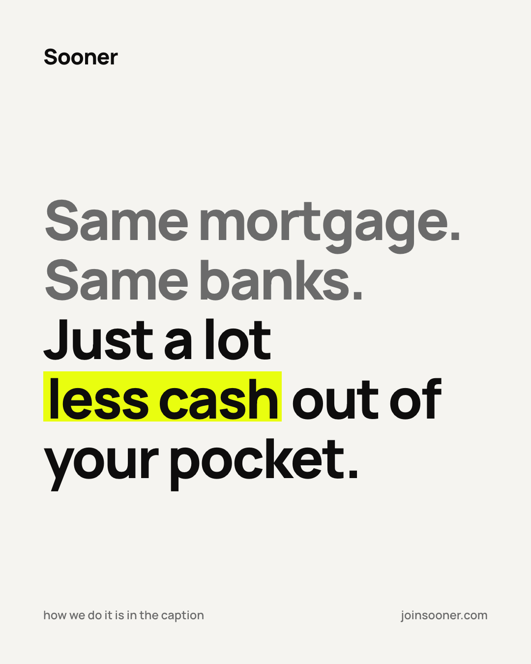
Same mortgage. Same banks. Just a lot less cash out of your pocket.

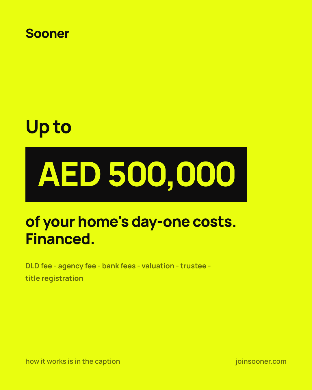
Up to AED 500,000 of your upfront costs covered - paid back monthly.

Your down payment is all you'll need.

Not our voice

We provide comprehensive financial solutions for property acquisition.

Our innovative platform leverages technology to streamline the homebuying journey.

Take the first step towards your dream home today!

Unlock your homeownership potential with our tailored solutions.

The calculator breakdown
Lead with what they need. Break it into clean line items. Bold the total. This is our most-used pattern.

To buy this home today, you need:

Down payment (20%)AED 400,000
DLD fee (4%)AED 80,000
Agency commission (2%)AED 40,000
Mortgage processingAED 26,250
Total upfrontAED 553,600

Pattern rules

  • - Context line at top: what they're looking at
  • - Dot leaders between label and value
  • - Bold total at bottom, separated by solid rule
  • - Hierarchy through size, not decoration
  • - CTA that sells before the click
The gut-punch stat
Massive number first. Context second. The number should hit before the brain processes the words.
AED 166K
in upfront support - paid by Sooner
63%
less cash needed to move in
AED 2M
home - AED 553K upfront - you pay AED 400K

Formatting rules

  • - Currency: always AED - never "Dh" or symbols
  • - Numbers: use commas - AED 300,000
  • - Abbreviate large numbers in headlines - AED 166K
  • - Percentages: 20% not twenty percent
  • - No exclamation marks. Confidence doesn't shout.

Information hierarchy

  • 1. Gut punch number - the stat that stops the scroll
  • 2. Breakdown - the context that makes it real
  • 3. CTA - that sells before the click
  • This order is sacred. Never bury the number.
Transactional email
Dark header with logo, clean white body, yellow CTA button, cream footer. Every email should feel like the brand - minimal, confident, direct.

Email rules

  • - Header: dark (#1C1B17) background, white logo
  • - CTA: yellow (#E9FE0F) button, dark text, 8px radius
  • - Body: white background, dark text, 14-16px
  • - Footer: cream (#F5F4F0) background, muted text
  • - One CTA per email - sell the outcome
  • - Same voice rules: confident, direct, no fluff
Do's and don'ts
When in doubt, choose restraint. Less is always more with Sooner.

Do

  • Keep it minimal and clean
  • Use generous whitespace
  • Let typography do the heavy lifting
  • Use yellow as an accent, not a background flood
  • Write in short, confident sentences
  • Lead with the number, explain second
  • Use "AED" for currency - always
  • Use commas in numbers: AED 300,000
  • Sell the outcome in your CTA
  • Use pill buttons (border-radius: 100px) in the app
  • Use cream (#F5F4F0) as app background
  • Use regular dashes (-) not em dashes

Don't

  • Add a period after "Sooner" in the logo
  • Use "Dh" instead of "AED"
  • Use drop shadows or gradients on cards
  • Use dark backgrounds on app screens
  • Use emojis in document/upload cards
  • Write in corporate jargon
  • Use ALL CAPS on buttons
  • Bury numbers in paragraphs
  • Use exclamation marks
  • Use em dashes anywhere
  • Use dark borders on selected states (use yellow)
  • Write CTAs that don't sell ("Submit", "Click here")
One brand, three surfaces
Sooner renders differently depending on where it appears. Never mix the systems: each surface has its own ink, type, and yellow law. Product is sections 01-13 of this page; the other two surfaces are specified in full in 15 - Marketing & Social and 16 - Internal & Investor.
Product - app and funnel

Everything on this page.

  • - Cream canvas, ink #1C1B17, Manrope 700/800 headings
  • - Yellow is an accent only - never a background
  • - Kit radii, pill buttons, no shadows, no dark screens
  • - Built exclusively on sooner-kit.css
Marketing and social

Numbers are the imagery.

  • - Ink deepens to #0E0D0D (the website's --dark-900)
  • - Yellow as marker sweeps, number blocks, stamps
  • - Social-only exception: full-yellow reverse posts, max ~2 per 9-post grid, never adjacent
  • - Geist Mono for receipts and tabular devices
  • - Wordmark only where the art doesn't already say Sooner
  • - No stock couples, keys, skylines or handshakes
Internal tools and investor

Ink and paper, one volt gesture.

  • - Helvetica Neue, not Manrope
  • - Radius 0 on everything (status pills excepted)
  • - Flat depth: border ladder + background steps, no shadows
  • - The volt law: yellow only for focus, hover flips, the highlighter mark, one link per band, progress, live pills
  • - One highlighter mark per screen, on the phrase that matters
The marketing surface
Paid and organic creative, the website, OOH. Same brand, deeper ink, and the yellow works harder: sweeps, number blocks, stamps. Numbers are the imagery.
Tokens
  • - Ink deepens to #0E0D0D (not the app's #1C1B17)
  • - Cream #F5F4F0 stays the canvas; yellow #E9FE0F stays the accent
  • - Headlines: Manrope 700/800, tight (-0.03em), grey-then-black turn: setup lines in grey #6B6B6B, the payoff line in ink
  • - Geist Mono + tabular-nums for receipts and tables
Imagery law
  • - Numbers are the imagery: receipts, meters, blocks, stamps
  • - No stock couples, keys, skylines or handshakes
  • - Billboard-style posts with photoreal humans are the sanctioned exception - AI-generated (Higgsfield), composited under type, negative space reserved for the headline
  • - Mix statics and billboards so the feed reads like a real brand
Social mechanics
  • - Posts are 1080x1350 (4:5), built as HTML, rendered headless - never hand-edited PNGs
  • - Wordmark only where the art doesn't already say Sooner
  • - No on-image index numbers - they read as internal tooling
  • - Type-led posts carry a caption hook at the bottom ("the full math is in the caption")
  • - Captions are hook-first, ~55 words: first line sells alone, close with "link in bio" + "No documents, no credit impact"
Specimens - the launch grid treatments
Type-led flag post
Type-led: the flag, grey-then-black turn, one sweep.
Receipt object post
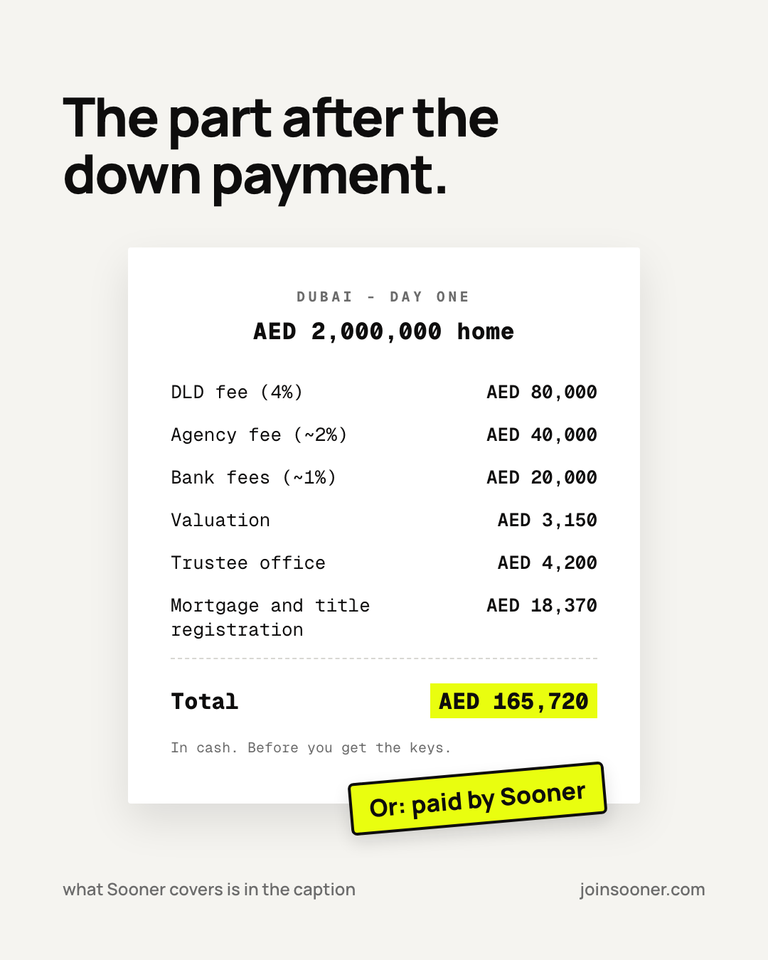
Object: the receipt in Geist Mono, branding lives in the stamp - no wordmark.
Yellow-ground reverse post
Yellow-ground reverse: social-only exception, max ~2 per 9-post grid, never adjacent.

Do

  • Anchor on the canonical numbers: AED 2,000,000 home, AED 165,720 stack, up to AED 500,000
  • Keep the same fee lines on both sides of any comparison - only who pays changes ("paid by Sooner")
  • Attach "flat" to the ~10% a year price framing
  • Promote key numbers into headers, never footnotes
  • Give bottom halves air - stamps, terms and footers each get their own lane

Don't

  • Show underwriting machinery (DBR, LTV, scores, gates)
  • Name banks as villains - banks are partners we win rates from
  • Use yellow grounds outside social creative
  • Sum the monthly mortgage and Sooner support into one number
  • Promise rates - they are always "assumed X%"
The internal surface
Decks, the data room, internal tools. Ink and paper, one volt gesture per screen, straight edges everywhere. The quality bar is Ramp / Klarna / Linear: serious, flat, typographic. This section is set in its own idiom - straight edges, Helvetica - on purpose.
Tokens
  • - Type: Helvetica Neue, not Manrope
  • - Ink #1C1B17 on paper #FFFFFF; panels #F5F4F0 > #EBEAE4
  • - Grey text #6B6A66 (AA), faint #8F8E88; border ladder #EFEEE9 / #E5E4E0 / #C9C8C2
  • - Dark surfaces: ink ground, cards #26251F, borders #38372F, secondary text #A5A4A0
  • - Error red here is #C0392B (the app uses #D32F2F - per-surface, do not unify)
Shape & depth
  • - Radius 0 on everything: buttons, cards, inputs, modals (small status pills are the lone exception)
  • - No box shadows - depth is borders + background steps; the volt focus ring is the only shadow-like device
  • - Hovers are outline or fill swaps - nothing lifts, scales or bounces
  • - Kickers 11px / 700 / +0.22em uppercase are the only letterspaced element
  • - Ranges take a spaced en dash: 7.5 – 10% (typographic ranges only; the no-em-dash prose rule stands)
The volt law

Volt #E9FE0F is a scalpel, not a paint bucket. Allowed only:

  • - Focus rings and focus-visible outlines
  • - Hover flips (ink button → volt with ink text)
  • - The highlighter mark - one per screen, on the phrase that matters
  • - One accent link or CTA per band; progress bars; rare live/action pills
  • Never: on app-UI headlines, as large background bands, as decoration or icon tinting
Motion
  • - State swaps 120-180ms; entrances 280-450ms; big crossfades 550-600ms
  • - Signature entrance is "rise": fade in + translateY(14px) to 0
  • - Easing cubic-bezier(.22, 1, .36, 1); always honor prefers-reduced-motion
Data visualization
  • - Horizontal bars: label left, track middle, value right; volt for the hero series
  • - Direct labels over legends; no gridlines, no 3D, no rounded caps
  • - On dark panels: volt bars, white value labels
Layout discipline
  • - The left grid line is sacred: kicker, headline, labels and notes share one left edge
  • - Fixed-stage decks: 1920x1080 stage, everything in stage-space px, never vw/vh inside
  • - Confidential surfaces get the diagonal watermark tile (viewer email + date, ~6% opacity)
Craft & process, every surface
The disciplines that hold regardless of surface. These are what make the work feel expensive.

Always

  • One line beats two: no orphan words, ever - if it fits on one line, it must not wrap
  • tabular-nums on any number that updates or aligns
  • Structure first: lo-fi wireframe with real copy before hi-fi; decisions recorded with the why
  • Screenshot 375px AND desktop before calling a screen done
  • Self-review every render before showing it: spacing, wraps, crowding
  • Settle pixel disputes by measurement, not by eye
  • Verify responsive surfaces at 2-3 very different window sizes

Never

  • Lorem ipsum - copy is real from the first wireframe
  • Invent numbers - compute from the canon or don't show them
  • Mix surface systems (Manrope in a deck, radius in the data room)
  • Edit rendered PNGs - edit the source, re-render
  • Ship a visual pass without a review loop
Document uploaded successfully